The Astor Card
The St. Regis Bangkok’s members’ club - a full collateral system, a members’ website, and the email campaigns behind its restaurants, bars and spa.
- Sector
- Luxury hospitality
- Client
- The St. Regis Bangkok
- Role
- Designer and front-end developer - collateral, website and email marketing
- Scope
- Collateral system, print production, responsive website and members’ portal, EDM design and HTML/CSS build
- Tools
- Adobe Creative Suite, HTML, CSS, JavaScript
- Year
- 2017-2019
The problem
A loyalty programme at a five-star hotel is not a discount scheme. It is a piece of the brand that a member carries in their wallet, hands to a waiter, and is seen holding - so it has to survive that scrutiny in the hand, in print, and on a phone at seven in the morning.
The Astor Card is The St. Regis Bangkok’s members’ club, built around the hotel’s restaurants and bars - Viu, Jojo, The Drawing Room, The St. Regis Bar, Decanter and the Pool Bar - and the Elemis Spa.
What I did
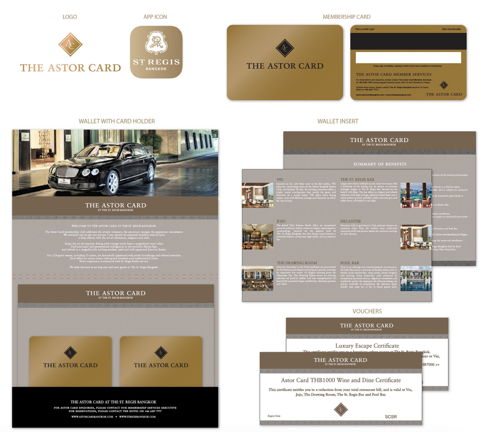
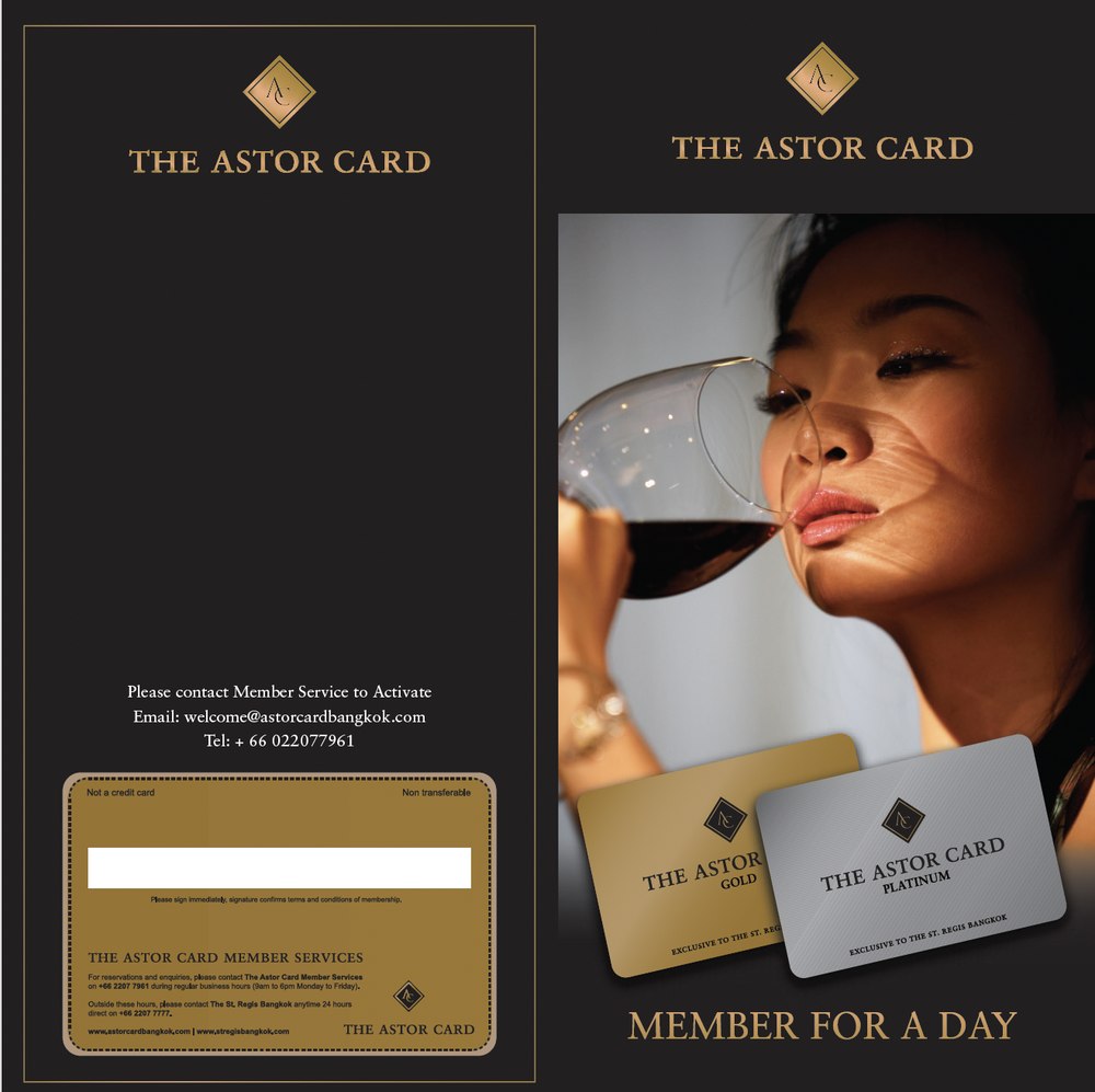
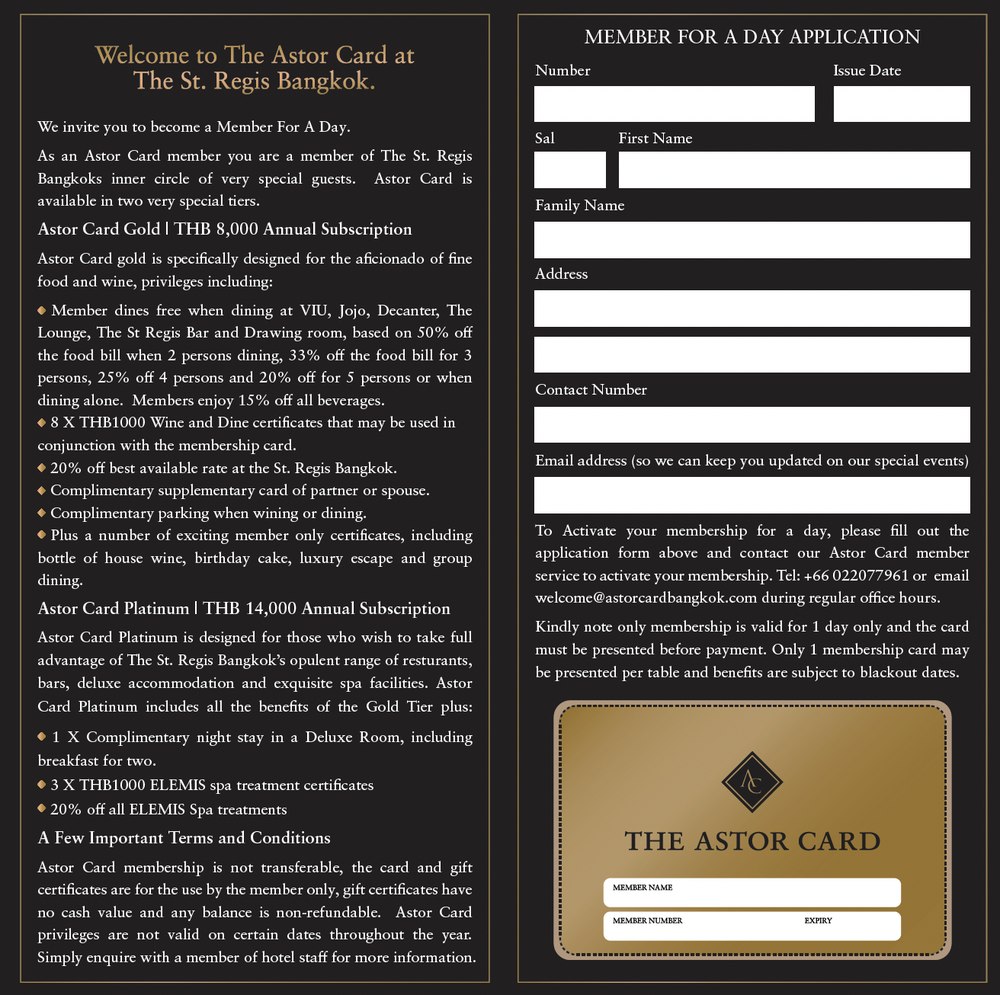
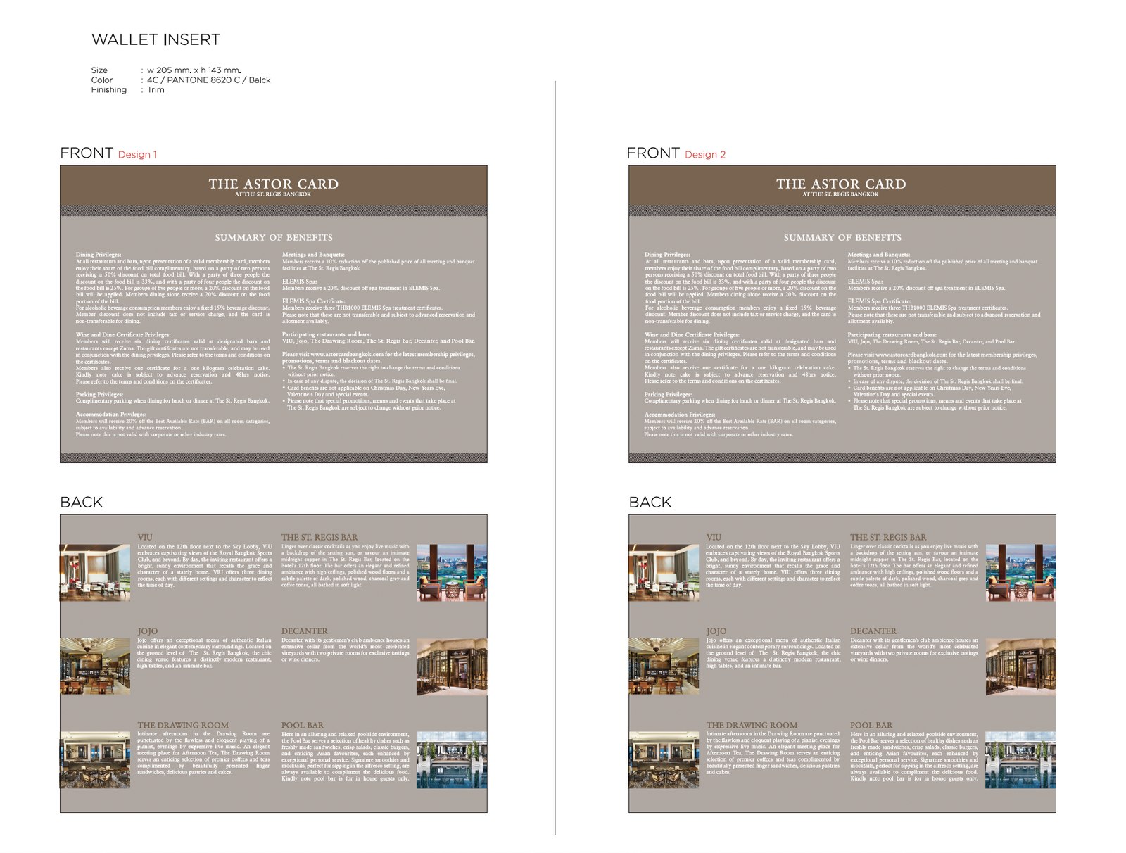
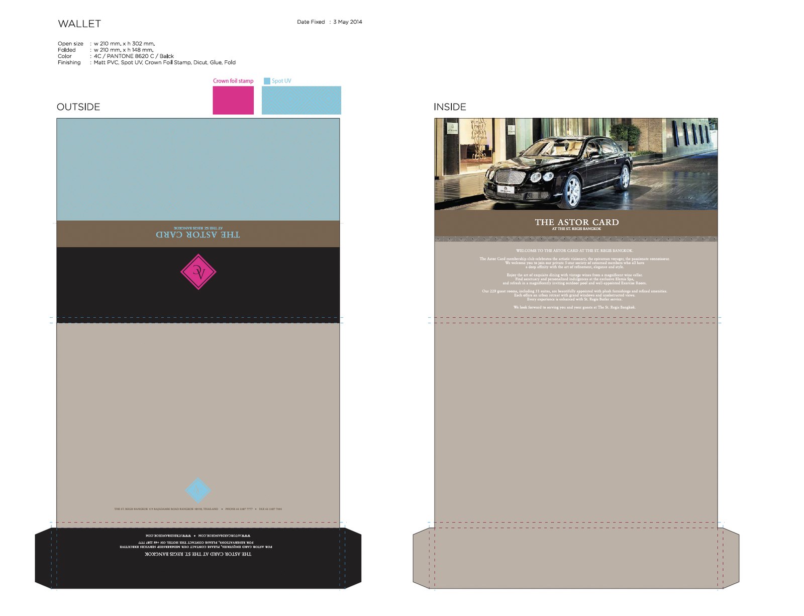
Two halves. I designed the collateral system - identity, membership cards, the wallet and its inserts, envelopes, certificates, vouchers and table tents - through to print production: dielines, Pantone matching, spot UV and crown foil stamping.
Then the email marketing. I designed and hand-built the EDMs in HTML and CSS, made them mobile-friendly, sent them to the membership and tracked open rates against each campaign.
Both halves meant working directly with the people who owned the offer: the hotel’s F&B directors and the Head of Spa. A restaurant promotion is their revenue, not a design exercise, and the brief usually arrived as a commercial target rather than a layout.
The collateral system
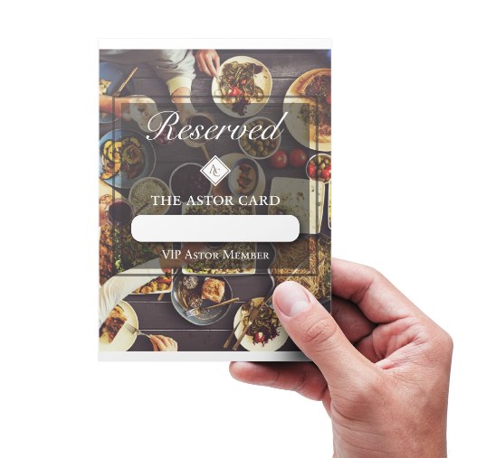
The system had to cover a lot of surfaces: a card that goes in a wallet, a wallet that goes in a pocket, inserts that explain a dozen benefits without reading as terms and conditions, certificates that feel worth redeeming, and table tents that hold a reservation without looking like a plastic stand.
The print specification was part of the design, not a handover note. Matt PVC, spot UV, crown foil stamp, die-cut and fold - the finish is most of what makes a card feel expensive when someone picks it up.
The website
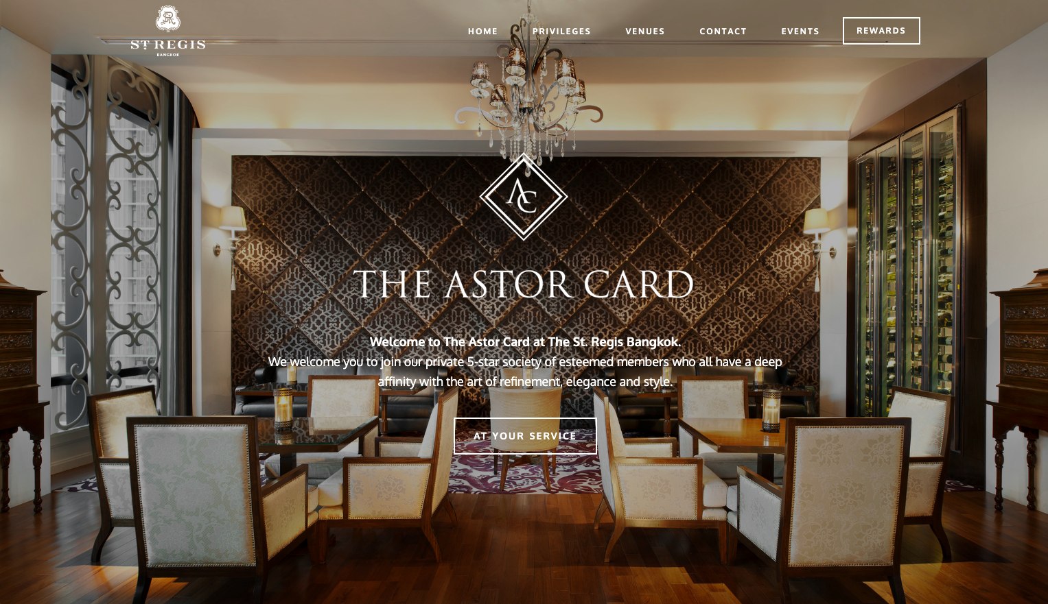
The programme had a public face at astorcardbangkok.com - the address printed on the back of every card and on the wallet insert, and the one place a prospective member could look before asking about joining.
It carries the same system as the print: the diamond mark, gold on dark, and the hotel’s own rooms as photography rather than stock. The navigation is the membership itself - privileges, venues, events - so the site answers the question a member actually arrives with.
I designed it and built it myself, responsive, in HTML, CSS and JavaScript - including a members’ portal behind the public pages, where a cardholder signs in to their own privileges rather than reading the brochure version.
The campaigns
The card gave the hotel a reason to write to its members, and the restaurants gave it something to say. Monthly Connoisseur highlights, seasonal menus, wine dinners, afternoon tea, and the visiting-chef residencies that the F&B team built their calendar around - including Michelin-starred chefs cooking limited runs at Jojo.
Each was designed and then coded by hand in HTML and CSS, because an email client is not a browser and a layout that survives Outlook is a different craft from a layout that survives Chrome. Every send was checked on mobile before it went out, and open rates were tracked campaign to campaign.
Elemis Spa
The spa ran on its own rhythm. Treatments are booked further ahead than dinner, the audience skews differently, and the offer is a state of mind rather than a menu - so the spa campaigns were designed as their own strand, built with the Head of Spa, while staying recognisably part of the same programme.
Outcome
The Astor Card shipped as a complete set - identity, cards, wallet, inserts, certificates, vouchers, table tents and the members’ website - and ran as an ongoing campaign programme across the hotel’s restaurants, bars and spa.
It is also the clearest example of something that runs through all of the hotel loyalty work: the design is judged in the hand, and the measure is whether a member books.