Sip and Indulge
W Singapore Sentosa Cove’s members’ club - the same job as the St. Regis programmes, in a brand voice that is its exact opposite.
- Sector
- Luxury hospitality
- Client
- W Singapore - Sentosa Cove
- Role
- Designer - collateral and email marketing
- Scope
- Selected collateral, print production, EDM design and HTML/CSS build
- Venues
- The Kitchen Table, SKIRT, WOOBAR, WET, AWAY Spa
- Tools
- Adobe Creative Suite, HTML, CSS
The problem
Same brief as the St. Regis programmes: a members’ club built around a hotel’s restaurants, bars and spa, and a set of pieces that has to work in the hand and in an inbox.
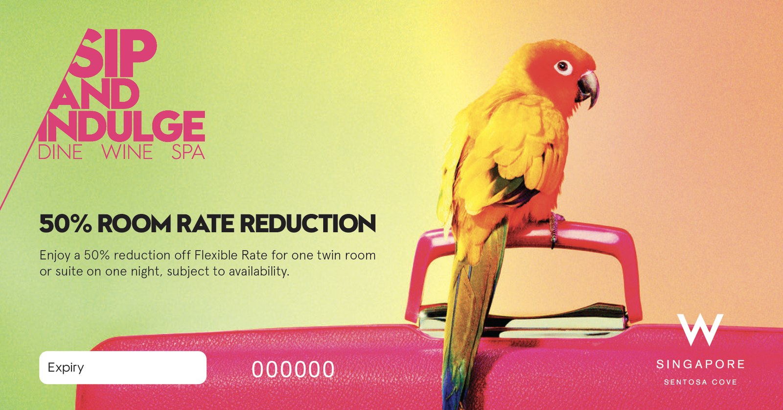
Everything else about it was the opposite. W is loud where St. Regis is quiet - SKIRT, WOOBAR, WET, The Kitchen Table and AWAY Spa, a brand that describes its own service as ‘no-attitude’. Gold foil and a serif would have been wrong in every direction.
What I did
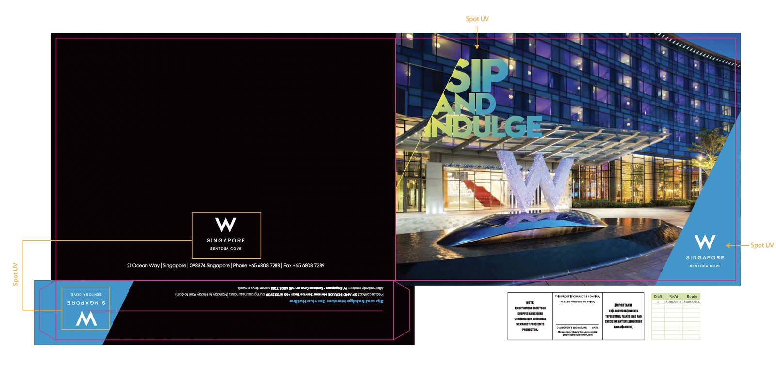
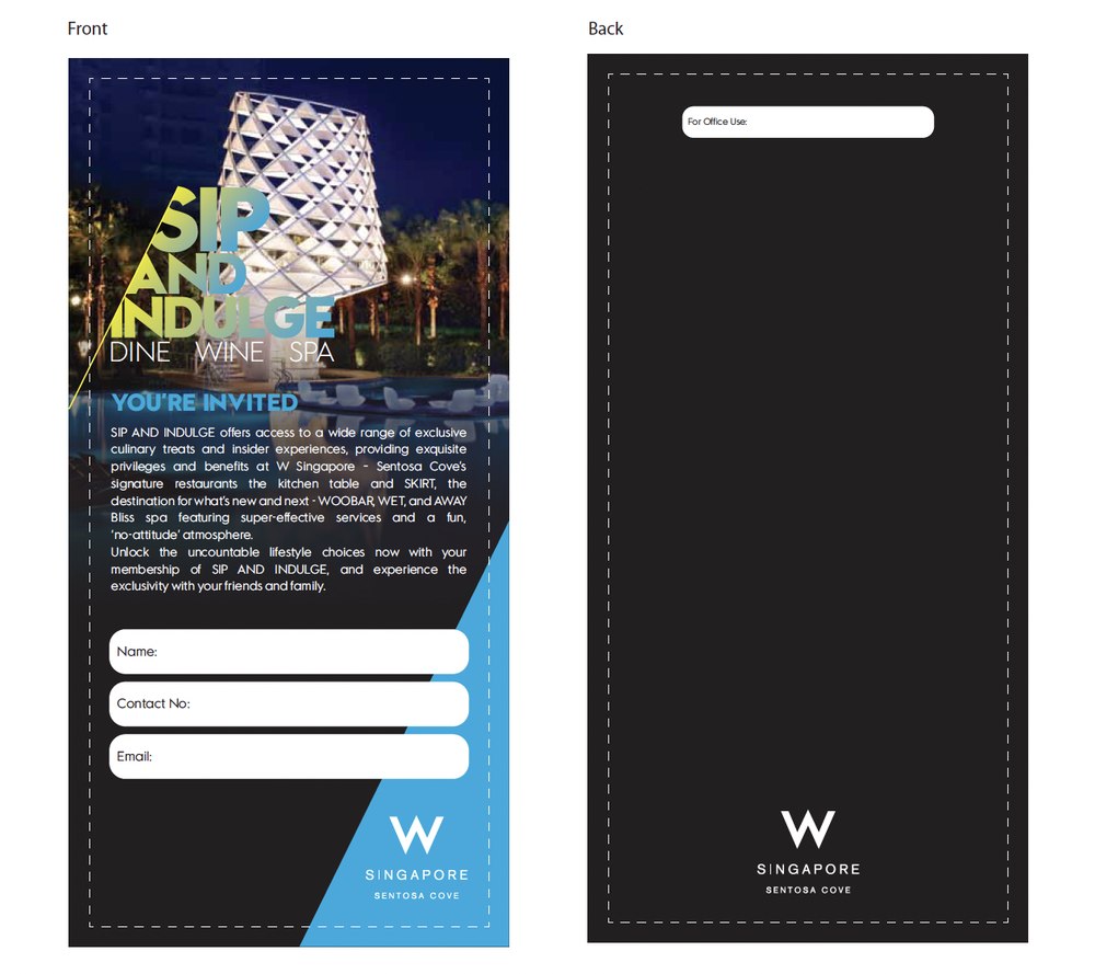
A smaller package than the others, and no website: selected collateral - the wallet, the billfold, the certificates - through to print production, and then the email campaigns.
The EDMs were designed and hand-coded in HTML and CSS the same way, checked on mobile, and sent to the membership.
The brand voice
The whole job was working out what restraint means for a brand that has none. The answer was structure rather than decoration: the Sip and Indulge lockup always cut on the same diagonal, a fixed relationship to the W mark, and then the photography allowed to be as loud as it liked - neon, a parrot, a wall of fried eggs.
Print finishing stayed disciplined even so. The wallet carries spot UV on the mark and the lockup, which is what keeps a bright, busy piece feeling like a five-star hotel rather than a flyer.
The campaigns
Monthly sends across the whole property - brunches at The Kitchen Table, offers at AWAY Spa, events at WOOBAR and WET - each one built to carry a price, a date and a booking link without losing the brand’s nerve.
Outcome
Sip and Indulge ran as a members’ programme across W Singapore Sentosa Cove’s restaurants, bars and spa, with the collateral in the hand and the campaigns in the inbox.
Taken beside The Astor Card and Supper Club it is the useful one: three loyalty programmes for three five-star hotels, built to the same standard and looking nothing like each other. That is the job - the brand decides, not the designer’s taste.